Paradis Des Voyageurs- A Traveler’s Haven
We had the honor of designing one of the largest rooms at the Mansion in May recently. Mansion in May is a showhouse held in NJ every 2-3 years. The committee selects a storied Mansion with history, and designers apply for different rooms with a design concept. We designed the Primary bedroom for the Mansion in May 2023. Paradis Des Voyageurs- a traveler's haven, is a room inspired by the eclectic French aesthetic of curated rooms with romance.
Why did we pick this room?
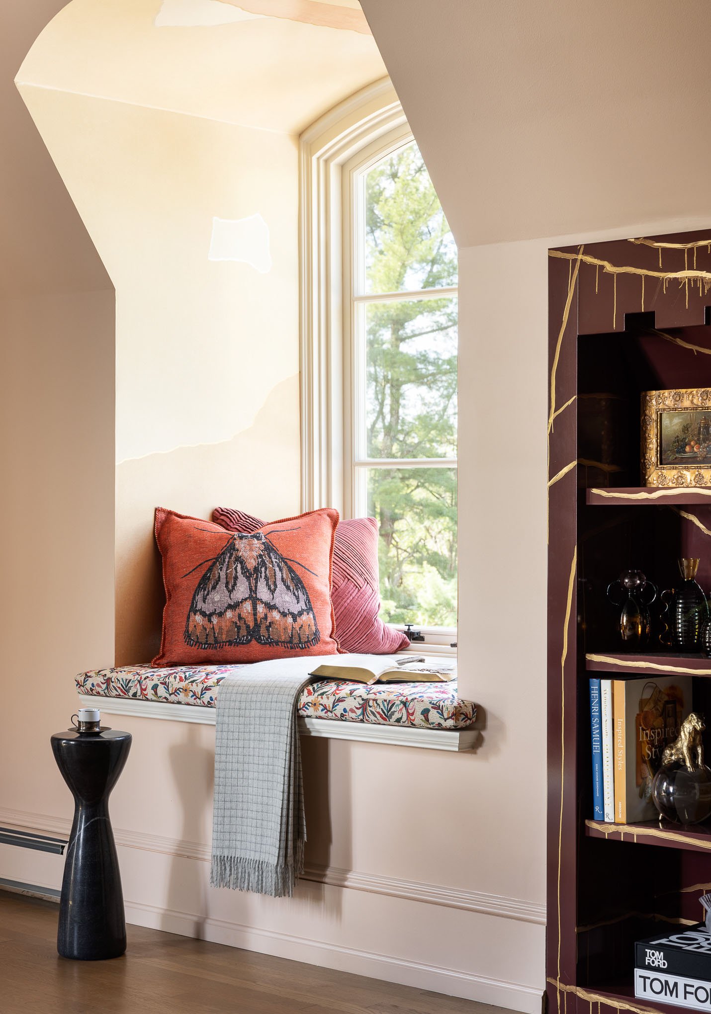
I loved the beautiful window seats. As a child sitting by the window and spending my afternoons lost in the stories by PG wood house, Rudyard Kipling, Charles Dickens, Roald Dahl, Earnest Hemmingway, Mark Twain, and countless other excellent writers, window seats are the nostalgic vehicles of journey to a fantasy world, for me. And this room had three. So this was my guiding source of inspiration.
Challenges of the space?
The space came with many challenges. First, the Low walls with angles gave us hardly any wall space, so we had to get creative in designing and installing our furniture and creating height in the room.
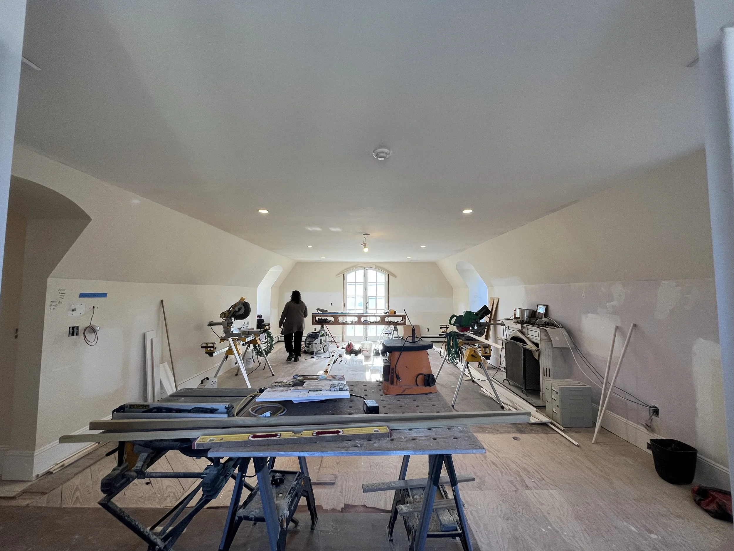
Second, the room's scale is a large bedroom; the room is 35 feet long by 20 feet wide with only 8 ½ feet high ceilings, and most of the walls were 5 feet tall. So I had to get creative in creating warmth and a comforting and inviting vibe in a large room.
Bedrooms should be inviting and comfortable, and that is where our work began in getting creative to make this room a haven. We first started with space planning for this room. To make the room proportionate, we had to break it down into smaller areas. Like the sleeping area, the sitting area, the read-a-book or have-a-nightcap before-bed area, and the dressing/work-from-home area.
The inspiration.
I have always been fascinated by Parisian apartments, the mix of old and new, and the rich jewel-tone colors. This bedroom was designed for a world-traveling couple. So we wanted to have both masculine and feminine touches and create a romantic and inviting space.
The color palette
We started with the dark hand-painted silk wallcovering by Fromental. The stunning aesthetic of Travertine is both understated and mesmerizing. The brushed and layered effect is created using washes of iridescent metallic silk paint, resulting in a shimmering texture reminiscent of travertine stone. This set the mood for space. The deep rich color of this wallcovering helped recede the ceiling, make the room look taller, and add to that much-needed coziness. We then finalized the wall color by Benjamin Moore, Queen Anne Pink, and beautiful peachy blush. The blush tones of the wall, offset with the dark masculine tones of the ceiling, thus balancing the yin and the yang of the masculine and feminine, make this room a perfect space for a couple.
Remember the window seats that inspired me to pick this room, I had to make sure they became magical areas, So we applied the Rexine by Fromental in the window wells and the dressing area. Soft, quiet tones of stone and rose pink brings a sense of calm, while occasional flashes of burgundy strike a fascinating contrast. The modern abstract pattern is different in each window well, thus creating a unique experience for the viewer. The abstract patterns can be read as maps of countries or various geographical features, encouraging the flights of fantasy. And the fabric on the window seat cushions added a cheerful yet world-inspired flair to the window seats.
Curating the room
Once our base palette was set, we started to curate the room and think about each area as an individual vignetter but still part of this ample space.
The Bed wall.
This wall took most creativity to resolve; I knew I wanted the bed to have prominence in the space, given that it was a bedroom. But the slanted walls were very restrictive. So I decided to take the challenge and convert it into an advantage; I designed the bed to follow the room's architecture and created a sight canopy to keep the bed current yet impactful. The textured yellow from Stout textile had a modern honeycomb pattern yet timeless, and the trim on the canopy was a nod to the classic French canopy beds. Once we finalized our bed design, we had to address the angle walls. The upholstered wallcovering was a great way to add texture and softness to the space. The beautiful custom bench is a perfect space for morning tea or seating. And the fabulous Guo Pei X Rug Company rug tied the vignette together.
The Fireplace wall.
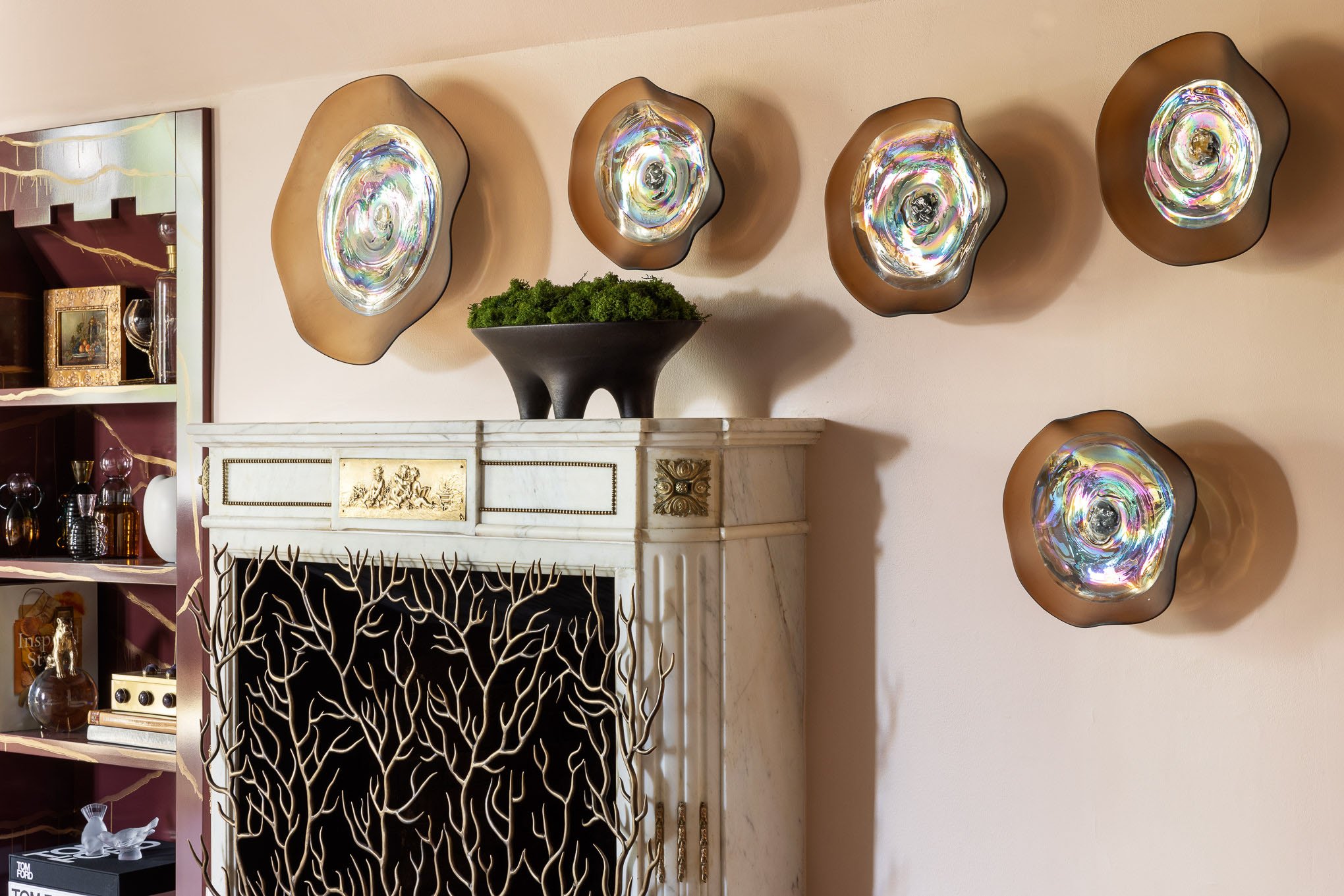
The fireplace wall had the existing wood-burning fireplace that we paired with a beautiful fire screen by John Lyle. We also added custom built-ins to display all the items our travelers collect during their travels and the many books they have read or plan to read. The beautiful glass sculpture highlights the asymmetrical aspect of the wall and brings light to the area. The custom Built-ins are painted in a high gloss burgundy color inspired by the traditional Chinoiserie cabinets. We then had an artist paint the abstract lines inspired by the fretwork design usually found on the chinoiserie cabinets.
The Seating area.
The seating is the area we had the most fun with. The antique French settee was covered in three different fabrics and trim, each fabric from a different country. The antique French fireside chairs are paired with a coffee table by Djivan Schapira and other modern pieces of furniture to keep the space timeless and current. The Window Treatment by Shade store is in Sheila Bridges, Harlem Toile, adding the story and cultural reference to the room. The beautiful yellow rug by the Rug company pulls the yellow from the bed and anchors the seating area. The compilation of fabrics and furnishings from around the world narrates a beautiful story and creates a beautiful vignette.
The Game Table Area
This section of the room is such a vibe; we envisioned a couple unwinding with a board game and scotch before they retire. The comfortable tub chairs and the game table are just a perfect space for a nightcap to work from home.
The Vanity Area.
This nook was an excellent opportunity to create a cocoon; the window was perfect for lighting the face for getting ready in the morning. But also great to light the face for those Zoom calls. Old library doors inspired the upholstered doors, but we put a twist by using modern cut velvet. So not only does upholstering the doors give this space a fabulous flair, but it also creates noise reduction.
Technology.
No room is complete without technological advances. So we have a hidden TV in the room? I am not a big fan of Television in the bedroom, but with a space so expansive, inevitably, some nights you may want to curl up on the settee and binge-watch your favorite show, so we included a hidden Tv in the room for when you need it.
The juxtaposition of traditional against the modern and the inclusion of technology make this an ideal space to come home to for a world traveler. A modern room with the charm of the traditional. A perfect space where one can snuggle with a cup of coffee and a book in the cozy window nook.


